15 Stunning Green Backsplash Kitchen Ideas for Modern Homes
Let’s be real for a second: we’ve all seen enough white-on-white kitchens to last several lifetimes. While the “all-white everything” look had its moment, many of us now crave a space that actually feels alive. If you want your kitchen to stop looking like a sterile laboratory and start looking like a high-end designer retreat, you need to look at green.
I remember the first time I suggested a bold green backsplash to a friend during her renovation. She looked at me like I had just suggested she paint her floor with neon pink polka dots. But once we found the right shade—a moody, deep forest green—the entire room transformed. Suddenly, her basic cabinets looked expensive, and the whole space felt incredibly grounded.
Green brings a certain “organic magic” that no other color can replicate. It connects your indoor space to the natural world outside while offering a range of moods from “peaceful spa” to “dramatic luxury.” Let’s walk through 15 stunning green backsplash kitchen ideas that will make your modern home feel like a masterpiece.
1. Sage Green Subway Tile Kitchen Backsplash
If you feel nervous about moving away from neutrals, sage green subway tile serves as the perfect “gateway green.” Think of sage as a neutral with a personality. It offers a grayish-green undertone that feels soft, sophisticated, and remarkably calming.
I love this feature because it plays well with others. You can pair sage green with white cabinets for a crisp look or with light wood for a more Scandi-inspired vibe. In my experience, a beveled-edge subway tile in sage green adds just enough shadow and depth to keep a flat wall looking interesting.
Why sage green works:
- It mimics the appearance of natural herbs and gardens.
- The color doesn’t overwhelm small spaces.
- It bridges the gap between traditional and modern aesthetics.
- It hides water spots much better than darker tiles.
Ever wondered why sage is so popular? It’s because the human eye finds this specific frequency of light incredibly easy to process. It literally makes your brain relax while you’re doing the dishes. 🙂
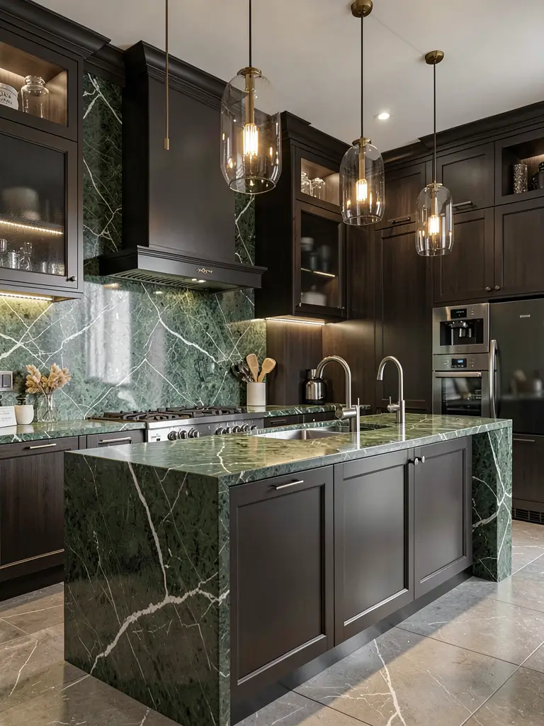
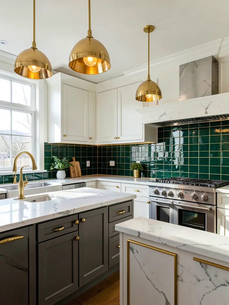
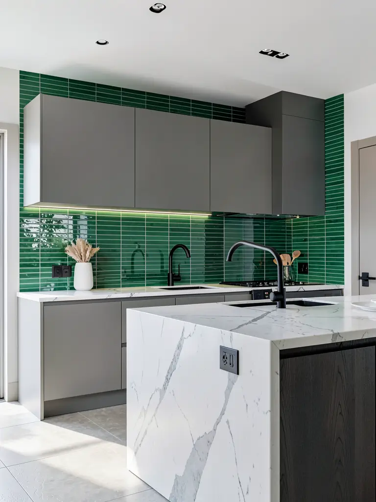
2. Emerald Green Luxury Kitchen Backsplash
Ready to bring the drama? Emerald green is the “showstopper” of the bunch. This isn’t a color for the faint of heart—it’s for the homeowner who wants to make a definitive statement. Emerald green tiles, especially in a high-gloss finish, create a jewel-box effect that screams luxury.
I once worked on a kitchen with dark charcoal cabinets and a full-height emerald green backsplash. We used a stacked vertical layout rather than the traditional brick-lay, which gave it an ultra-modern, architectural feel. The deep, saturated green looked like literal emeralds under the under-cabinet LED lighting.
Tips for emerald green:
- Use gold or brass hardware to lean into the “glam” look.
- Ensure you have excellent lighting, as dark greens can look black in a dim room.
- Stick to simple cabinet doors; the backsplash is the star here.
IMO, emerald green is the fastest way to add a “wow” factor to a house that feels a bit too builder-grade. It adds instant history and weight to the room.
3. Olive Green Backsplash with Warm Wood Cabinets
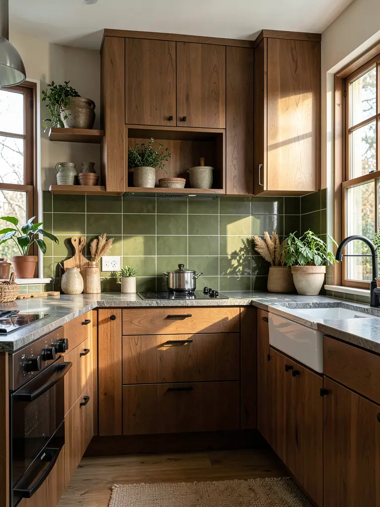
If your dream kitchen involves a lot of natural wood and an “earthy” atmosphere, olive green is your best friend. Olive has a yellow-brown undertone that makes it the warmest green in the family. When you pair this with warm oak or walnut cabinets, the result feels like a cozy Italian villa.
I personally prefer matte finishes for olive green. A matte olive tile doesn’t fight for attention; it just sits there looking reliable and sophisticated. I find that this combination works exceptionally well in kitchens that get plenty of natural sunlight, as the warmth of the sun brings out the golden tones in the olive.
Pairing suggestions:
- Walnut cabinetry creates a high-end mid-century modern look.
- Black stone countertops anchor the warmth of the olive.
- Terracotta floors complete the organic, Mediterranean vibe.
Ever wondered why this works so well? Nature uses this color scheme every single day in forests and fields. Our brains recognize “wood and olive” as a harmonious pair before we even realize why we like it.
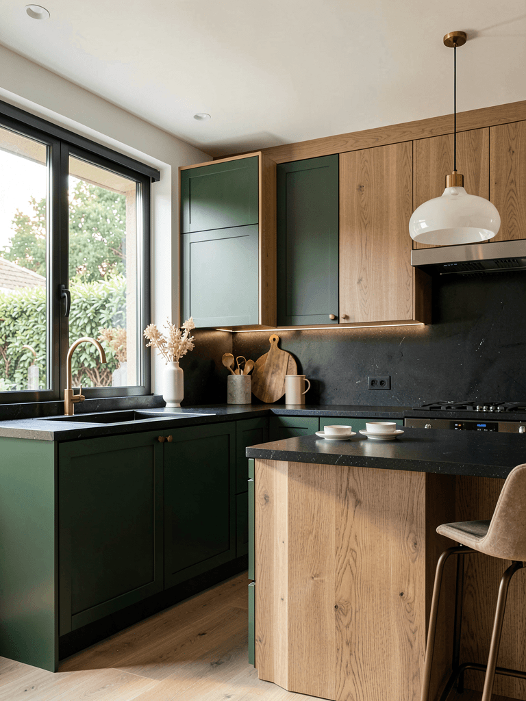
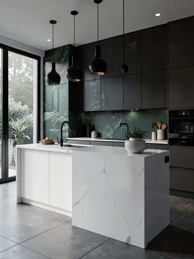
4. Dark Forest Green Modern Kitchen Accent Wall
Sometimes a small strip of tile isn’t enough. If you have an open-concept home, taking your dark forest green backsplash all the way to the ceiling creates a massive impact. This “accent wall” approach turns the kitchen into a structural feature of the entire house.
I love using large-format tiles for this look to minimize grout lines. Dark forest green is deep, moody, and undeniably sophisticated. It works perfectly with white quartz countertops because the high contrast makes the white look even brighter and the green look even deeper.
Design benefits:
- It creates a sense of visual height in the room.
- The dark color provides a moody backdrop for white or open shelving.
- It hides imperfections on older walls.
- It acts as a focal point for the entire main floor.
FYI, if you go with dark forest green, use a matching dark grout. Light grout against dark tile creates a grid-like pattern that can look a bit too busy when it covers a large area.
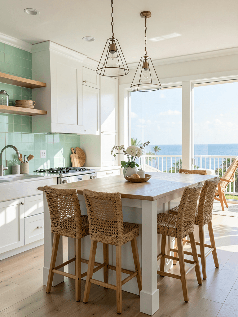
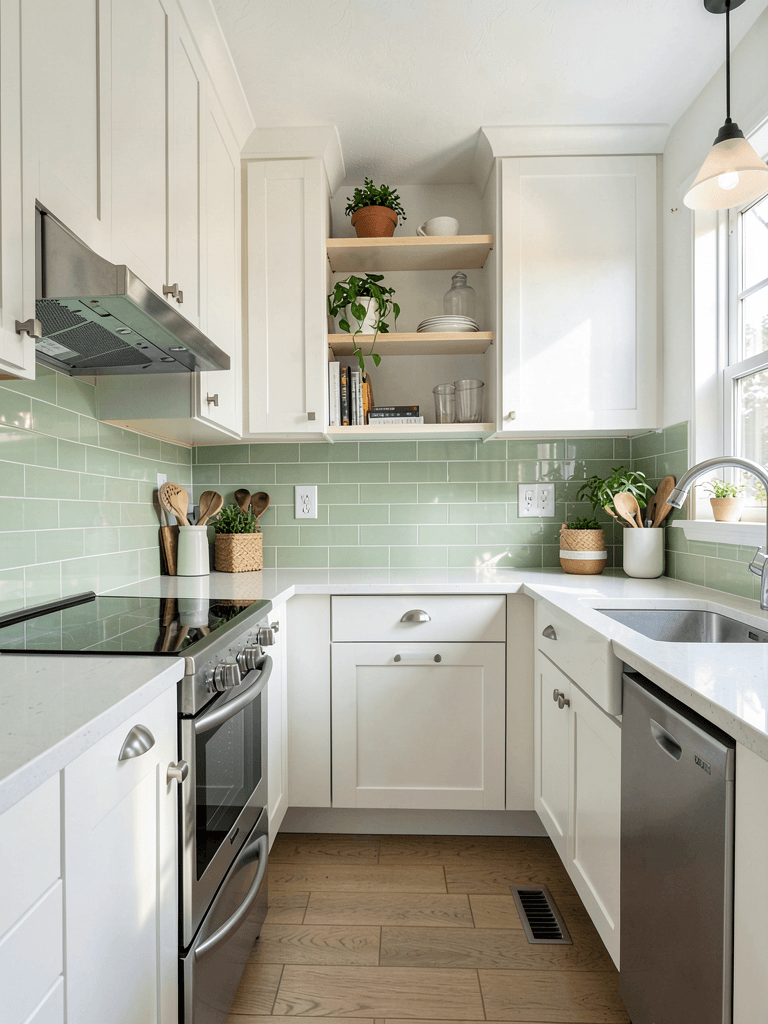
5. Mint Green Coastal Kitchen Backsplash
Maybe you aren’t looking for drama. Maybe you want your kitchen to feel like a breezy Saturday morning at a beach house. Mint green brings an airy, light-hearted energy that works wonders in kitchens that need a “refresh.”
I find mint green works best when paired with white shaker cabinets and butcher block countertops. The light wood and the pale green create a “coastal farmhouse” aesthetic that feels very approachable. It’s a great way to use color without making the space feel heavy or dark.
Why mint is a winner:
- It makes small, cramped kitchens feel much larger.
- The color is inherently cheerful.
- It looks fantastic with stainless steel appliances.
- It provides a vintage, retro-chic feel without being “old-fashioned.”
If you’re worried about resale value, mint is a safer bet than emerald. It’s subtle enough that most buyers won’t find it polarizing, but distinct enough to stand out from the crowd.
6. Green Zellige Tile Kitchen Design
Let’s talk about Zellige tiles because they are currently the “it” material in high-end design. These are handmade Moroccan clay tiles, and I honestly think they are the most beautiful tiles on the planet. No two tiles are exactly the same size, shape, or color thickness.
When you install a green Zellige backsplash, you get this undulating, shimmering surface that looks alive. Because the tiles aren’t perfectly flat, the light bounces off them in a million different directions. It creates a texture that manufactured tiles simply cannot replicate.
The Zellige Advantage:
- Artisanal Quality: Every tile tells a story.
- Color Depth: You’ll see shades of emerald, moss, and jade all in one box.
- Texture: The surface feels organic and tactile.
Pro-tip: You usually install Zellige tiles without grout lines (or very thin ones). This is a job for a professional tile setter who knows how to work with irregular materials. Don’t let a “handyman” practice on your expensive Zellige!
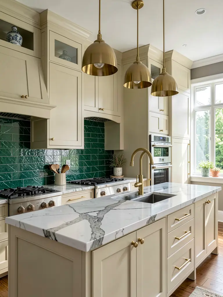
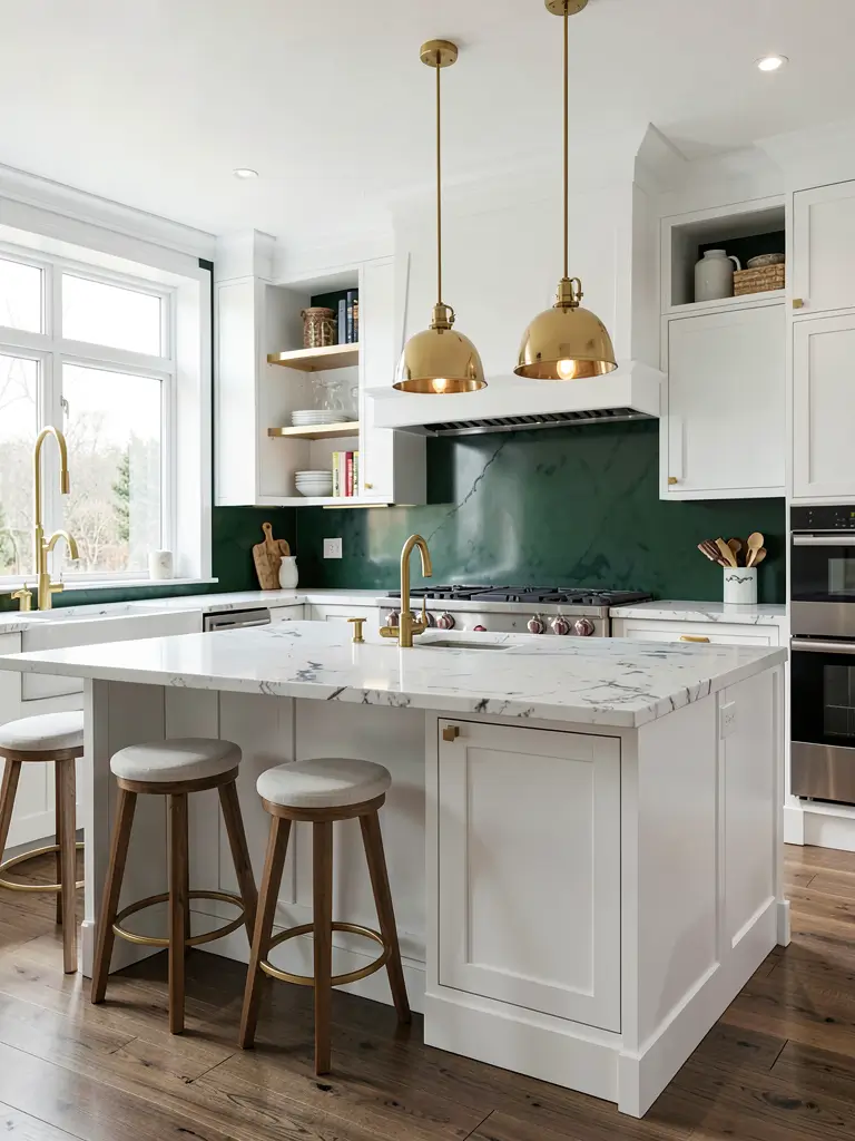
7. Green and Gold Glam Kitchen Backsplash
If you live for a bit of sparkle, you have to try the green and gold combo. This isn’t just a backsplash; it’s jewelry for your kitchen. Whether you use green tiles with gold inlays or simply pair a deep green backsplash with brass hardware, the result is pure glamour.
I recently saw a kitchen that used hexagon-shaped forest green tiles with actual gold-colored grout. It was bold, it was brave, and it looked like a five-star hotel bar. The gold warms up the cool tones of the green and adds a level of sophistication that is hard to beat.
Glam elements to add:
- Brass bridge faucets for a vintage touch.
- Gold-framed pendant lights over the island.
- Brushed gold cabinet pulls.
Does it feel like too much? You can always scale it back by using gold only in the light fixtures. The beauty of green is that it can handle a lot of metallic accents without looking tacky.
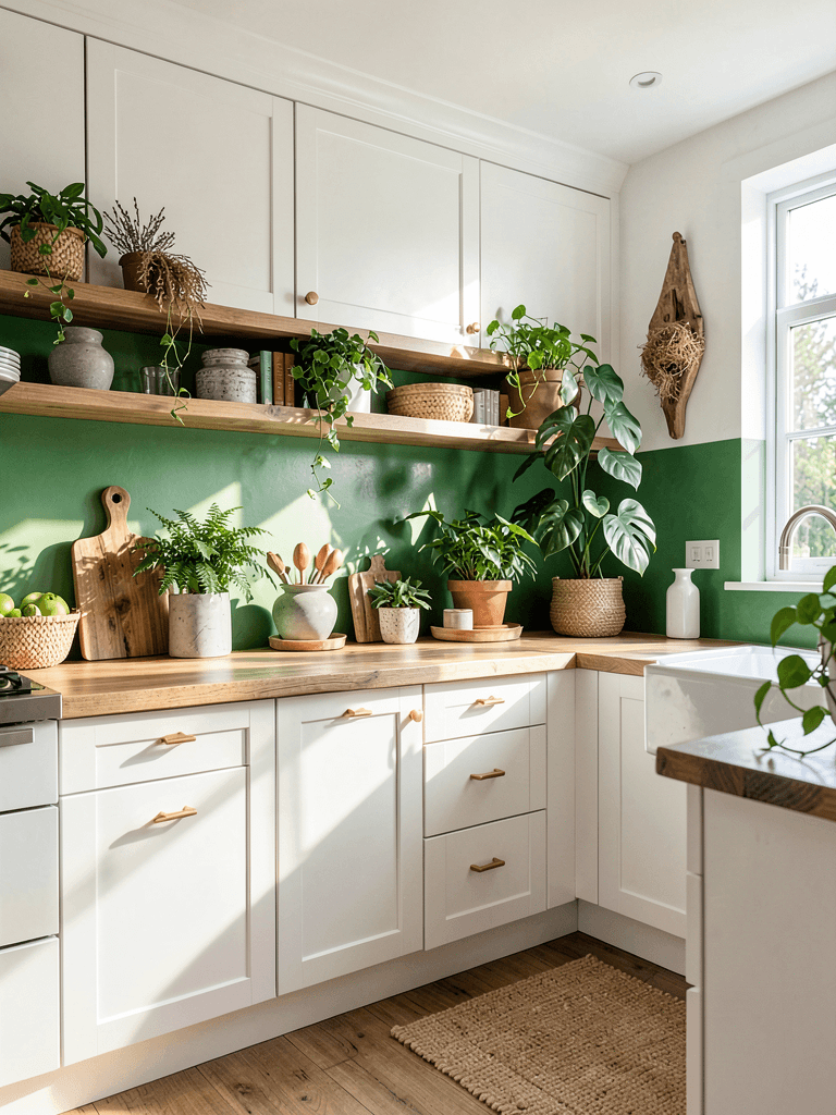
8. Farmhouse Kitchen with Soft Green Backsplash
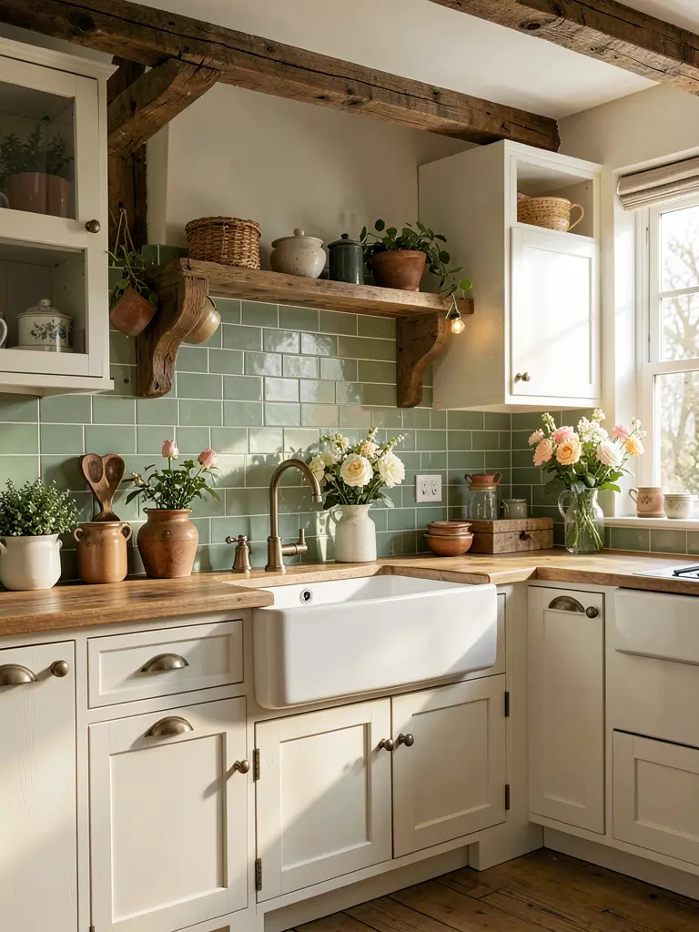
Farmhouse style usually means “all-white everything,” but I think that’s starting to change. A soft, muted green backsplash adds a level of charm and “cottage energy” that white subway tile just can’t touch. Think of colors like “seafoam” or “faded moss.”
I love using tumbled edges or handmade-look tiles for this style. You want the backsplash to look like it has been there for years. Pair it with a large white apron-front sink and some open wooden shelving, and you have the perfect cozy kitchen.
Farmhouse green styling:
- Pair with creamy off-white cabinets instead of stark white.
- Use vintage-style latches on your cabinet doors.
- Add a reclaimed wood island to ground the soft colors.
Ever noticed how some farmhouse kitchens feel a bit “flat”? The green backsplash adds the visual depth needed to make the white elements really pop.
9. Green Marble Look Kitchen Backsplash
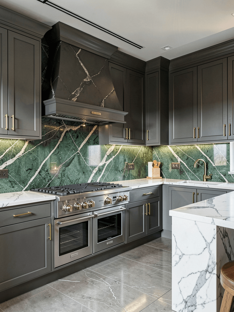
If you have a “luxury or nothing” mindset, you need to look at green marble. Specifically, look at stones like Verde Guatemala or Emerald Quartzite. These natural stones offer deep green backgrounds with incredible white or gold veining.
Since real marble is expensive and high-maintenance, many people now use porcelain slabs that look exactly like green marble. You get the high-end look without the fear of staining the stone with a spilled lemon. A full slab backsplash (no grout lines!) in a green marble pattern looks incredibly sleek and modern.
Comparing Real Marble vs. Porcelain:
| Feature | Natural Green Marble | Marble-Look Porcelain |
|---|---|---|
| Durability | Soft, can scratch/etch | Hard, very durable |
| Maintenance | Needs frequent sealing | Wipe and go |
| Aesthetic | Unique, one-of-a-kind | Uniform, predictable |
| Cost | $$$$ | $$ |
IMO, if you cook a lot of tomato-based sauces, go with the porcelain. It’ll save you a lot of stress in the long run. :/
10. Small Kitchen with Light Green Tile Backsplash
Working with a tiny kitchen? Don’t let that stop you from using color! The trick with small spaces is to stay on the lighter end of the green spectrum. A pale, glassy green tile can actually make a small kitchen feel more expansive because it reflects light so well.
I always suggest a vertical stack pattern for small kitchens. By placing the tiles vertically, you trick the eye into thinking the distance between the counter and the cabinet is much taller. It’s a simple visual hack that makes a massive difference in how the room feels.
Small kitchen tips:
- Stick to a monochromatic palette (green backsplash, light green or white cabinets).
- Use under-cabinet lighting to eliminate dark shadows.
- Choose a glossy finish to bounce more light around the room.
Small kitchens often feel like afterthoughts. A beautiful green backsplash proves that you put time and effort into the design, regardless of the square footage.
11. Vertical Green Tile Contemporary Kitchen
Modern design is all about the “unconventional.” If you want your backsplash to look like it belongs in 2024, flip your tiles vertically. Whether you use subway tiles, slim kitsch-kat tiles, or large planks, the vertical orientation is a hallmark of contemporary design.
I love this look in a muted moss green. It feels very architectural and intentional. When you align tiles vertically, you remove the “busy” feeling of a traditional brick-lay pattern, which creates a much cleaner, more organized aesthetic.
Why vertical works:
- It creates unbroken vertical lines that feel sophisticated.
- It sets your kitchen apart from the “standard” farmhouse look.
- It works perfectly behind a modern, chimney-style range hood.
If you really want to go for it, use a slim picket-shaped tile in a vertical orientation. It adds a bit of geometric interest without being overwhelming.
12. Green Herringbone Backsplash Kitchen Style
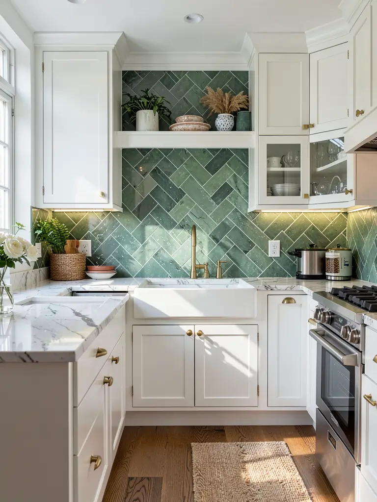
If you want a pattern that feels both classic and high-end, you can’t beat the herringbone. By placing rectangular green tiles in a V-shape, you create a sense of movement and energy across your kitchen wall.
I’ll be honest: herringbone is a nightmare to install. It requires more cuts, more tile, and a lot more patience from your contractor. But the results? Worth every penny. A dark jade green herringbone backsplash looks incredibly expensive and provides a rich texture that flat-lay tiles just can’t match.
Technical details:
- You’ll need roughly 15% extra tile for the cuts.
- Grout choice is vital—a contrasting grout highlights the pattern; a matching grout softens it.
- It works best as a focal point behind the stove.
Ever wondered why this pattern is so timeless? It draws the eye in multiple directions at once, making the wall feel like a piece of art rather than a functional surface.
13. White Kitchen with Deep Green Backsplash
This is the ultimate “safe but stylish” move. If you have an existing all-white kitchen and you want to give it a personality transplant, just swap the backsplash for a deep green. The high contrast between the white cabinets and the dark green tile is visually stunning.
It’s like adding a high-end designer rug to a room; it anchors everything. I suggest using a dark hunter green or juniper for this look. The dark green provides a “background” that makes your white cabinets look even cleaner and brighter.
Contrast benefits:
- It makes the room feel more intentional and designed.
- It provides a visual break in an otherwise white room.
- It allows you to use green accessories (like towels and plants) to tie the room together.
This is my go-to recommendation for people who are afraid of color. You keep your “safe” white cabinets, but you get to enjoy the beauty of green.
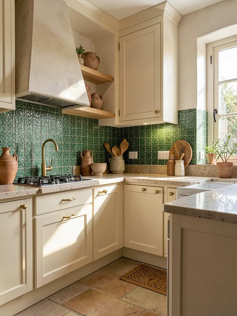
14. Rustic Kitchen with Earthy Green Tile Details
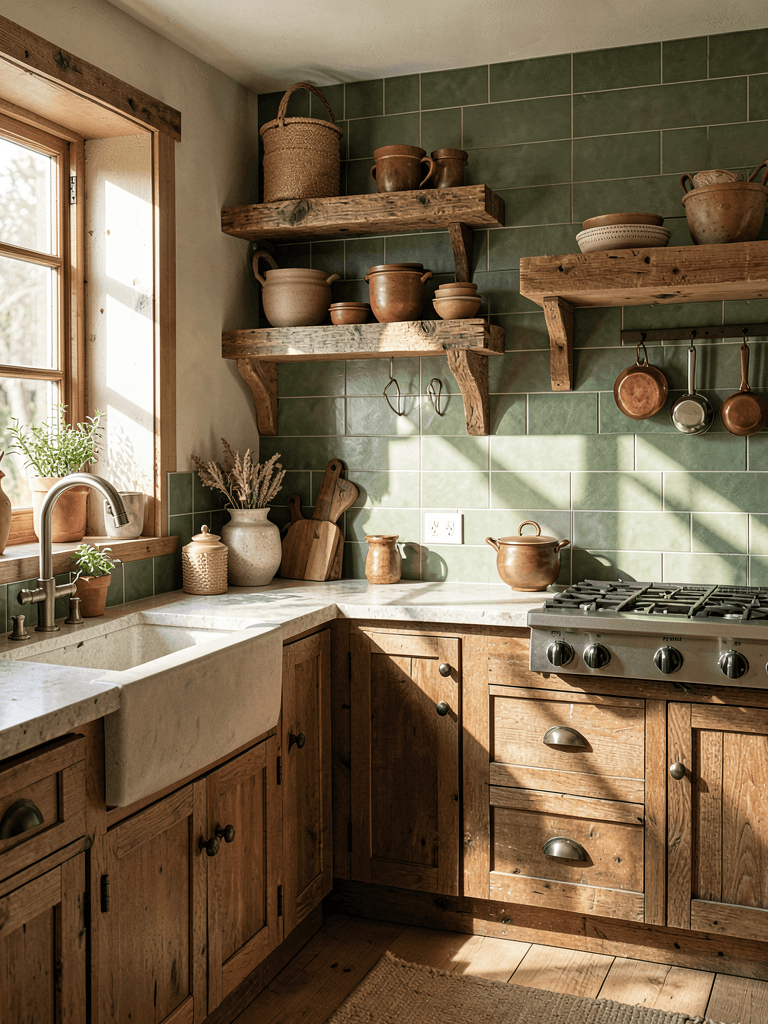
If your home has a lot of stone, brick, and rough wood, you need a backsplash that can stand up to those textures. Earthy, matte greens (think sage, pine, or olive) with an uneven, handmade texture are the perfect fit for a rustic kitchen.
I love using square tiles for this look rather than the usual rectangles. A 4×4 square green tile with slightly irregular edges looks like something you’d find in a centuries-old cottage. It feels grounded, honest, and completely unpretentious.
Rustic pairing ideas:
- Wrought iron hardware adds a touch of “old world” grit.
- Exposed ceiling beams frame the green backsplash beautifully.
- Unfinished wood shelves look stunning against a matte green wall.
Rustic doesn’t mean “messy.” It means focusing on materials that look like they came from the earth. A matte green tile is the perfect bridge between stone and wood.
15. Botanical Inspired Green Kitchen Backsplash Design
Finally, let’s talk about patterns. If you’re a fan of the botanical look, why not bring it into your backsplash? You can find stunning ceramic tiles with leaf motifs, or even use green glass mosaics arranged in floral patterns.
I once saw a kitchen that used patterned cement tiles in a soft green and white botanical print. It was delicate, beautiful, and made the kitchen feel like a conservatory. If you choose a patterned green tile, keep the rest of the kitchen very simple. You don’t want the backsplash to compete with busy countertops or ornate cabinets.
Design rules for patterns:
- Limit the pattern to one wall to avoid visual clutter.
- Choose a pattern with at least two shades of green for depth.
- Pair with natural greenery (real plants!) to reinforce the theme.
Rhetorical question: Why settle for a plain wall when you can have a botanical garden in your kitchen? It’s a bold choice that pays off in pure joy every single morning.
How to Choose Your Perfect Green: A Quick Guide
Alright, we’ve looked at the ideas, but how do you actually pick the one? It comes down to two main things: Lighting and Cabinet Color.
The Lighting Test
Before you buy a single tile, you must do the “lighting test.” Go to the store, get 3-4 different green samples, and tape them to your kitchen wall.
- Look at them at 8:00 AM (natural light).
- Look at them at 2:00 PM (bright sun).
- Look at them at 8:00 PM (artificial light).
I’ve seen “perfect” greens turn into “muddy browns” under warm yellow light bulbs. Make sure you love the color at all times of the day!
The Cabinet Match
- White Cabinets: You are the lucky ones. Every single green on this list will look good with white. Go bold!
- Black/Gray Cabinets: Stick to “jewel tones” like emerald or forest green. Pale greens can look washed out against dark cabinets.
- Wood Cabinets: Stick to “earthy greens” like olive, sage, or moss. These share the same warm undertones as wood and won’t clash.
Grout Color: The Secret Ingredient You’re Ignoring
Most people treat grout as an afterthought. That is a mistake! Grout is roughly 10% of what you see on your wall, and it changes the entire look of the tile.
- White Grout: This makes the green tile look crisp and clean. It’s perfect for a modern or coastal look.
- Matching Grout: This makes the backsplash look like one solid piece. It’s great for a sleek, minimalist vibe.
- Dark/Black Grout: This adds a moody, industrial edge. It also hides grease and dirt (a major win for messy cooks).
- Gold/Metallic Grout: Use this only if you want a high-glam, maximalist kitchen.
My Personal Verdict: Go with a light gray grout. It provides a subtle definition to the tile shape without being as harsh as white or as dark as black. It’s the “goldilocks” of grout colors.
Maintenance Tips: Keeping Your Green Gorgeous
A kitchen backsplash is in the “splash zone” (shocker, I know). If you want that stunning green to look good for twenty years, you need to maintain it.
- For High-Gloss Tile: Keep a microfiber cloth handy. Glossy tiles show water spots and streaks. A quick wipe-down once a week is all you need.
- For Matte Tile: Be careful with oil. Matte surfaces can absorb grease more easily than glossy ones. Always seal your grout and use a gentle, non-abrasive cleaner.
- For Zellige/Handmade Tile: These have more crevices. Use a soft-bristled brush (like an old toothbrush) to get into those little nooks and crannies once a month.
FYI: If you’re doing a DIY installation, make sure you use a waterproof sealer on your grout. Kitchens are humid, and you don’t want mold growing behind your beautiful green tiles. :/
Conclusion: Why Green is the Ultimate Choice
At the end of the day, your kitchen should be a place that makes you happy. Green is the color of life, growth, and renewal. Whether you go for the subtle sophistication of sage or the unapologetic luxury of emerald, a green backsplash is a choice that will age gracefully.
It’s a color that transitions through the seasons perfectly. In the summer, it feels cool and refreshing; in the winter, it feels cozy and grounded. It’s a design choice that says you aren’t afraid to step away from the crowd and create a space that is uniquely yours.
So, stop scrolling through Pinterest and staring at those white-on-white kitchens. Go to your local tile shop, grab a handful of green samples, and start your journey toward a more colorful, vibrant home. Your kitchen—and your morning coffee routine—will thank you for it. 🙂
Now, go get that level and start measuring. Your dream green kitchen is just a few boxes of tile away!